killer.
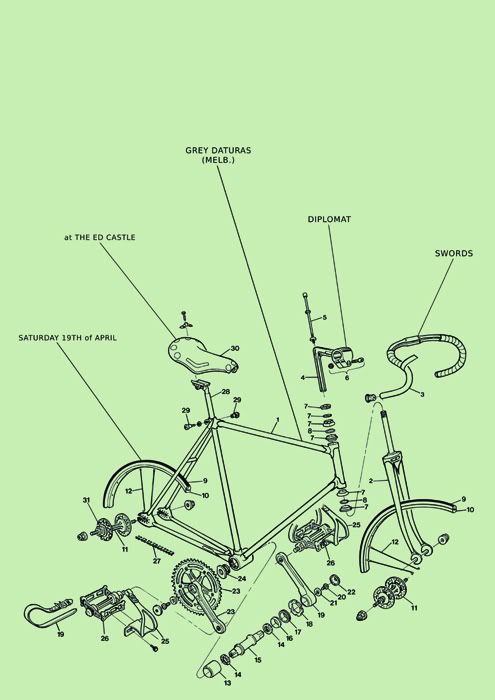
Nice and all, but goddamn impossible to read! An event poster is meant to provide information clearly, you’ve gotta rock some font size on that sucker.
I mean, form is all well and good but it ain’t worth shit without a bit of function in there as well!
I’d rather suck people in with the picture… Plus the poster will be A3, so the text will be reasonably big. I’d rather people stop and look at the poster than see the band names massive from 30 metres away…
Style over function, I say, but that’s just me…
I like it.
The font size seems consistent with that used for most diagrams I’ve read.
It gives the impression that the creator has only made minimal changes to the original, not just found a cool picture and deviated too far.
Simplicity is not always easy to achieve.
That said I do think it needs a heading, something that catches the eye.
I tried to keep the font size consistent to the other text that was on there (well the numbers) so the poster had more “flow”.
A3 poster.
Text should be at least 6mm if not closer to 10mm high to be read clearly
Even at A3 that text is going to be tiny. Surely the idea is to get people to attend the show, rather than create something that functions solely as eye candy?
I dunno, I do a shitload of event poster design and I’m of the firm opinion that the type and information takes precedence over graphical elements. Information hierarchy rules all.
A poster with tiny text has got to be pretty damn amazing for me to get close enough to find out what it’s about, and an exploded track bike diagram doesn’t identify with music enough for me to make the association and look closer for details.
I hope I don’t come across too harsh, just trying to help!
What context will the poster be displayed in? If you are posting it up around town for the public to see, the message definately won’t get across. People will just assume its a diagram.
Also Id suggest re arranging the order of your points. Like having the date appear first is a little odd, but maybe Im a little odd. I think the picture is quite awesome though.
after seeing too many punk shows advertised with writing that is borderline illegible, i have no problems with this. plus, gray daturas are awesome.
Looks good.