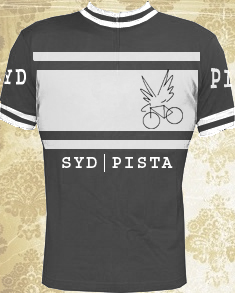
Black:
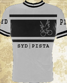
White:
Black:
White:
Tough critics.
I don’t mind the one above, I like the idea of colour options. Not mad on the type. I might play around with some more ideas later.
I actually like the original one!  Yes, its very iconic, but at least it’ll be recognised anywhere you wear it.
Out of the last 2, I rate the top one.
Like the banding but the graphic looks like the rider just exploded
Can you really fit PISTA on the arm?
Haha. Yeah ok, I see what you mean by the exploding rider- it’s what happens when you don’t have a tablet and you draw with a mouse.
Dunno if everything would actually fit together on the jersey, just thought I’d give it a go and maybe inspire someone else to do a better job.