I like clever graphics. Who doesn’t. Post them here. I’ll start of with a bicycle related one:

I like clever graphics. Who doesn’t. Post them here. I’ll start of with a bicycle related one:
We’re the fuck is it…? Or is it not iPad compatible?
Perhaps not very clever but I like this a lot.

Yeah it’s good!
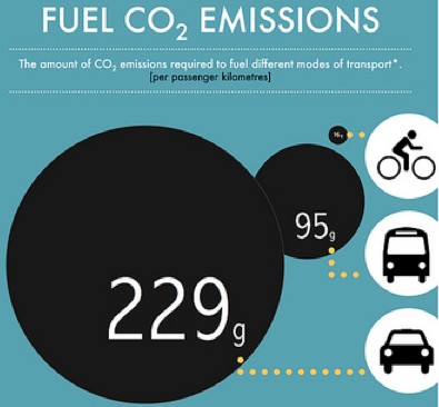
On the OP I think they’ve done themselves a bit of a disservice by zooming in on the car photo to make it look like they take up even more of the road, but it still gets the point across, albeit inaccurately.
That Freddie Merckx graphic reminds me of this:

The OP image/graphic is a broken link for me…
Should be fixed.
So good!
Click [u]here[/u] for full size.

![]()
Full size [u]here[/u].
Good match for the OP:

you must be into informationisbeautiful.net I assume?
tatsy data swivels used to be good but i think they’ve disappared.
Fast Analytics and Rapid-fire Business Intelligence from Tableau Software | Tableau Software is good, if you do this sort of thing for a living.
We are investigating Tableau atm, looking promising so far. Mainly for dashboarding though…
yea, it’s really good for dashboard stuff
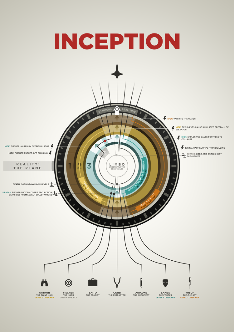
That is awesome. Inception has some good infographics too…
![[u]here[/u]](http://www.perceptualedge.com/blog/wp-content/uploads/2009/06/largest-bankruptcies-infographic.jpg)