Can anyone ID this font?
I’m lost. Failing an ID, I’ll be drawing it on CAD and dropping into the 'shop for work.
Can anyone ID this font?
I’m lost. Failing an ID, I’ll be drawing it on CAD and dropping into the 'shop for work.
Pretty close to AG Book Rounded. But there are going to be differences… main one I can spot is the M.
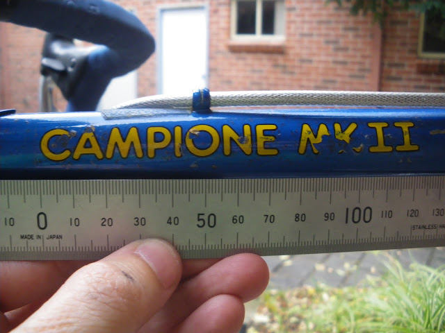
It looks like it says ‘campione mkII’ which i’m pretty sure is mexican for ‘second champion’
Haha, VAG.
Awesome…I have vag on my bike!
Enough schoolboy sniggering. Thanks P!N
^ No worries. In case anyone thinks I’m a graphics nerd, which I’m not, I actually went here and uploaded a cropped version of the image above. It then confirms the letters, then gives you a range of fonts it may be. All I had to do was find one with the trapezoid M. Pretty cool, huh?
Yay What the font. I use that a lot… If all else fails, there is a forum full of dudes who get boners off this sort of shit.
Do ya reckon people say that about us?
i wonder what the most obescure forum is? ie, whats the wierdest forum theme?
anyone know of some? or part of one??
The Megadeth forums… definately an odd bunch there :S
Storm Front forums are the weirdest, when studying anti-social behaviors for a Justice subject I was doing, did a lot of stalking/trolling on there, by far the weirdest bunch.
I’d lay money on it !
amateurs ![]() although that was my first thought.
although that was my first thought.
Oh man I spent a load of time there once, and learnt some weird things.
i doubt you learnt anything.
Anyway, back on topic: Here’s your font!
I dont care what they say about you Jams, I reckon you’re alright…
I broke out the CAD/shop skillz and drew it anyway in the meantime. I reckon I got pretty close:

Sorry Jams, I couldn’t spot it straight away… I don’t tend to use out of date fonts.
ooooooooooooooo. burn 
Not bad. I reckon it could be a bit bolder and watch the internal radii - the M looks a bit retarded.
nerd